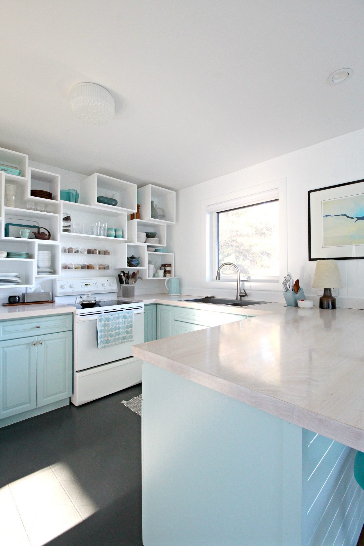
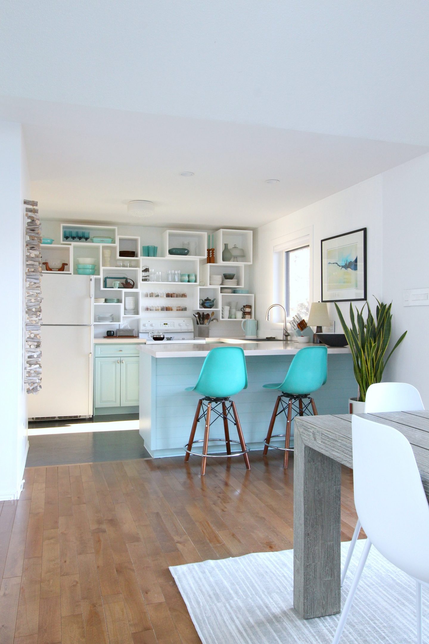
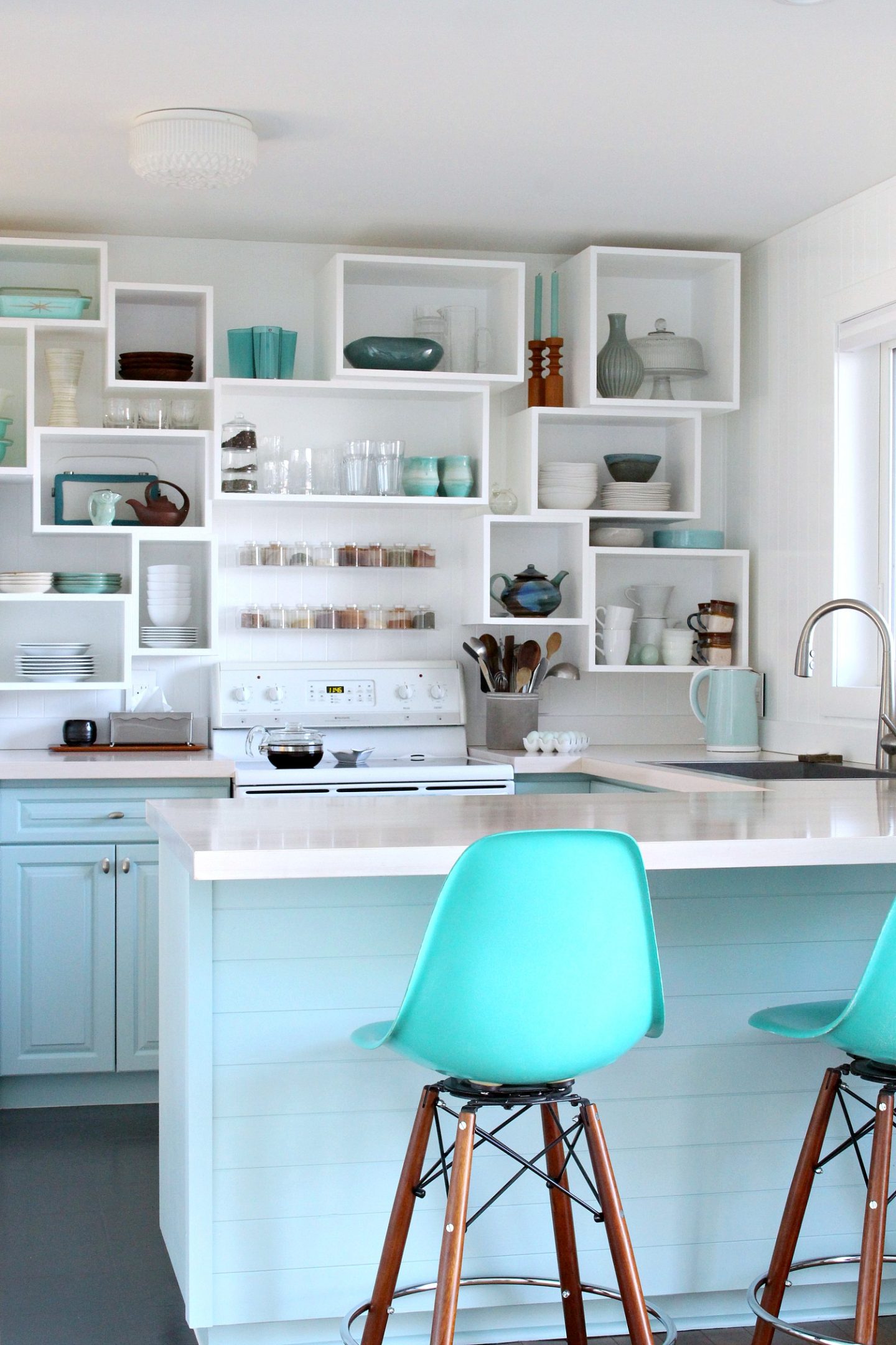
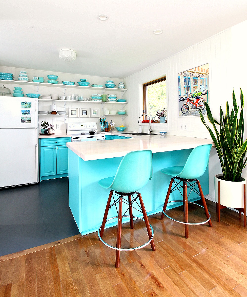
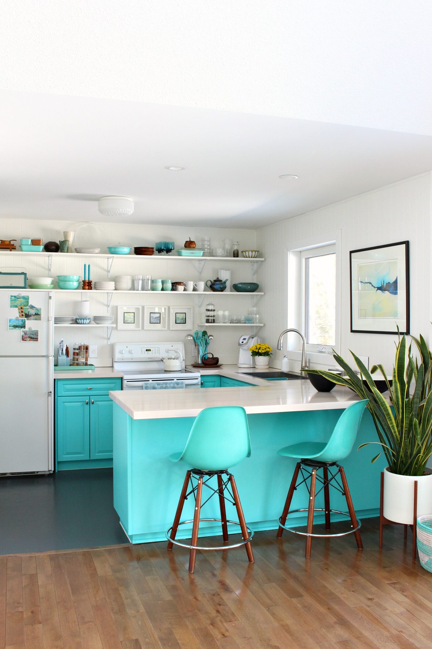
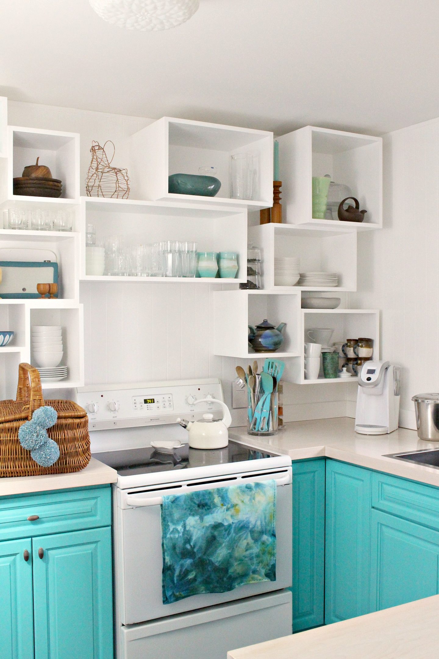
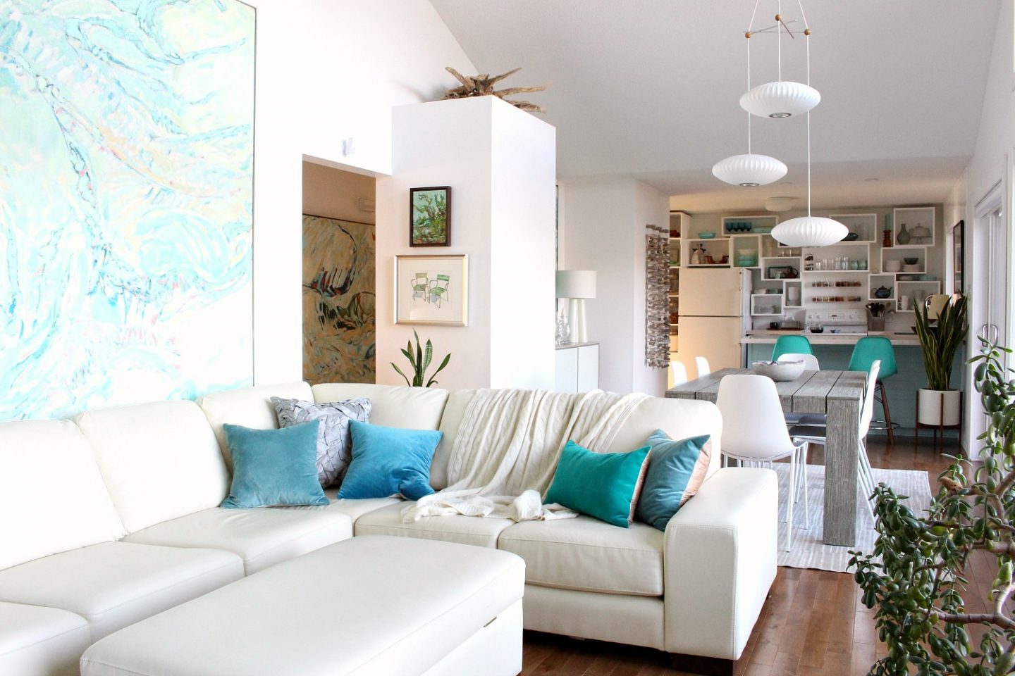
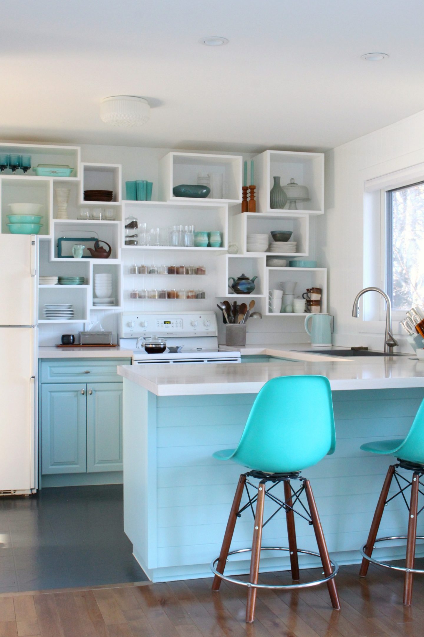
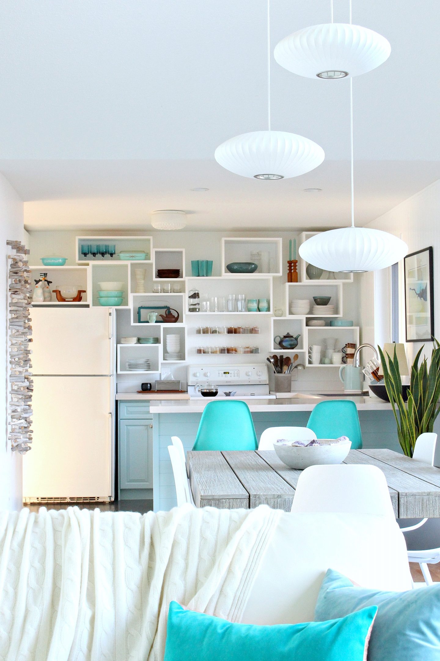
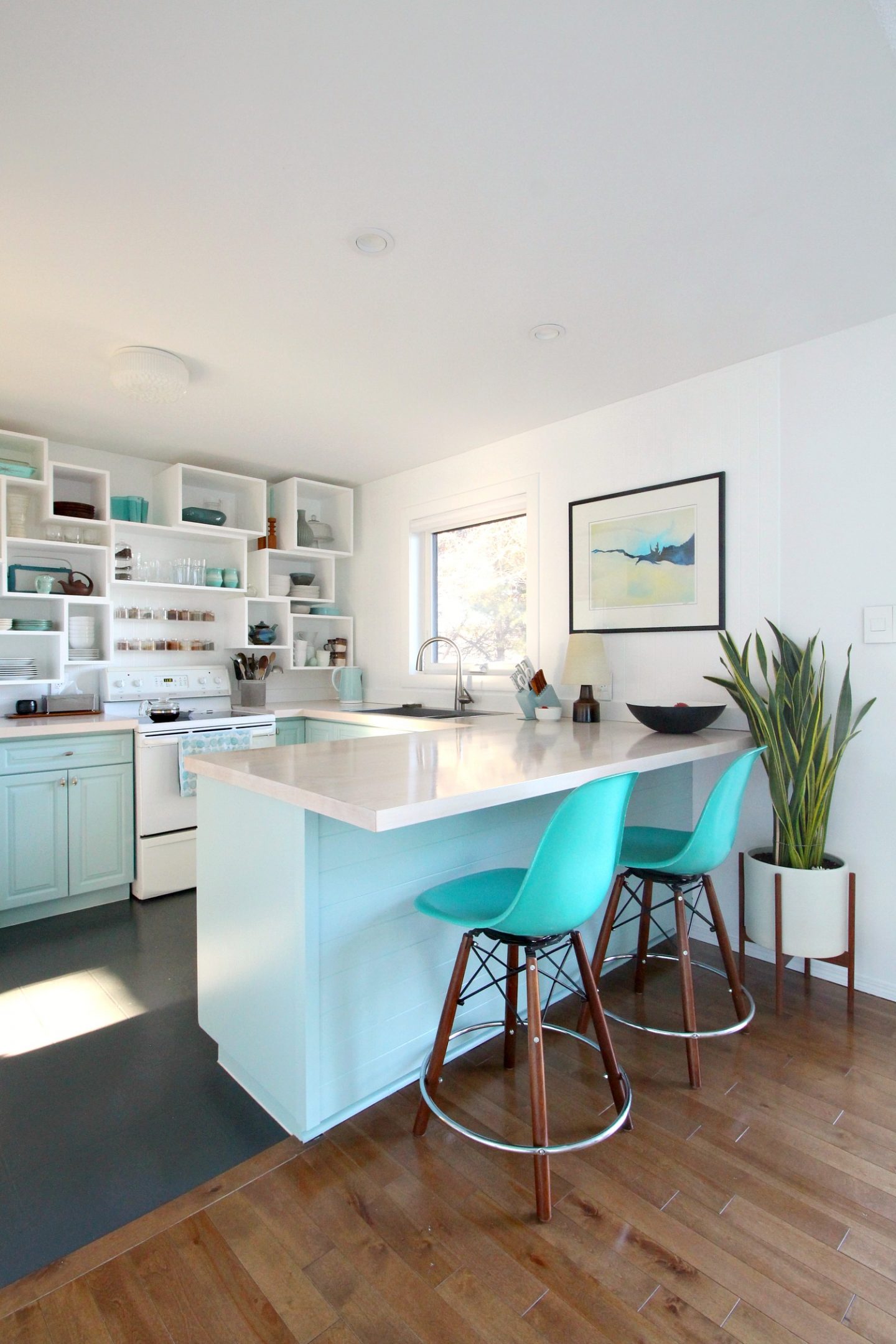
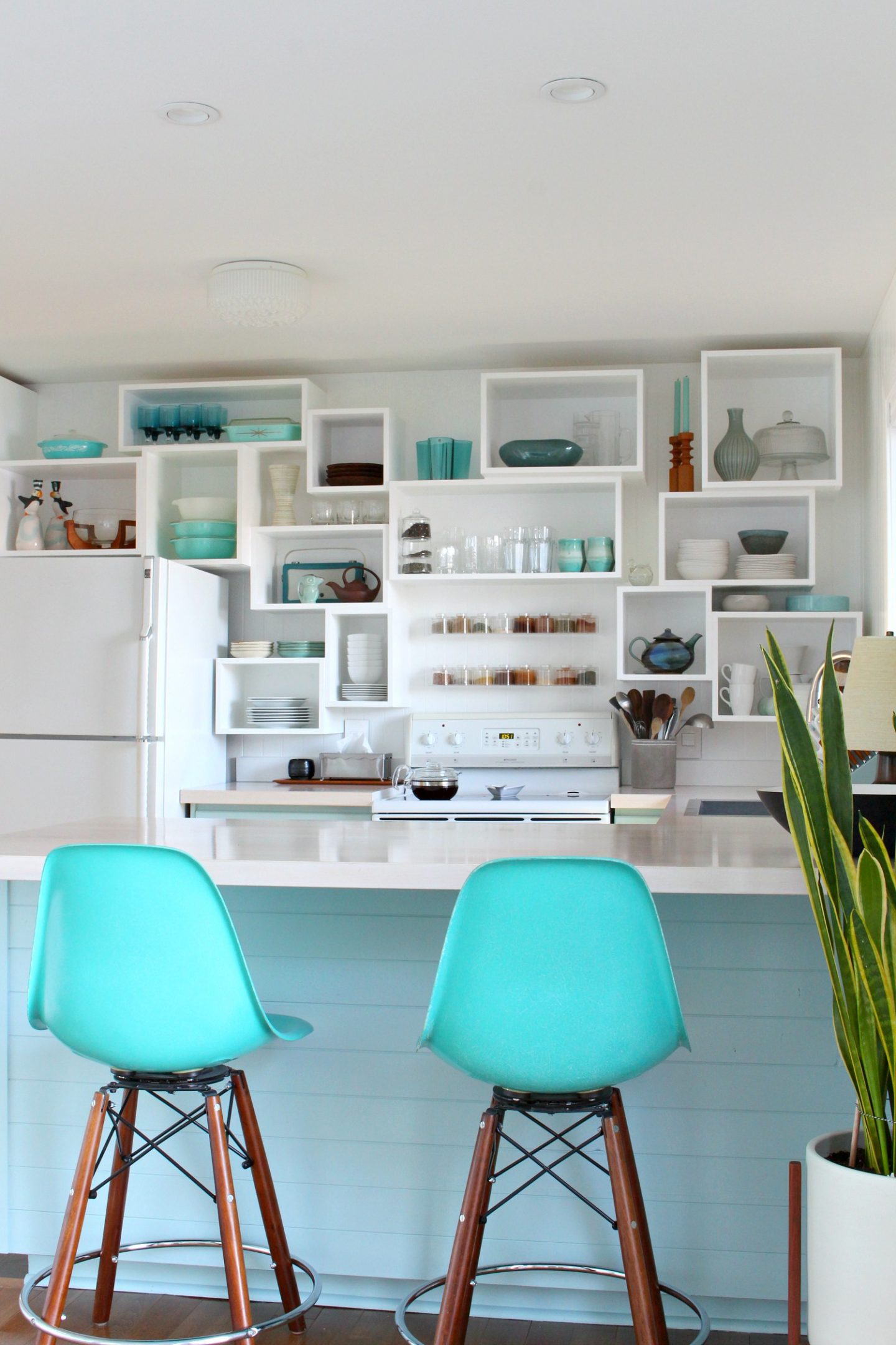
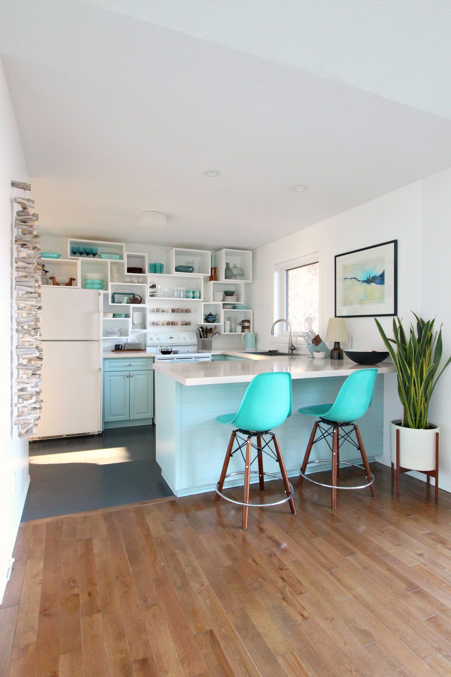
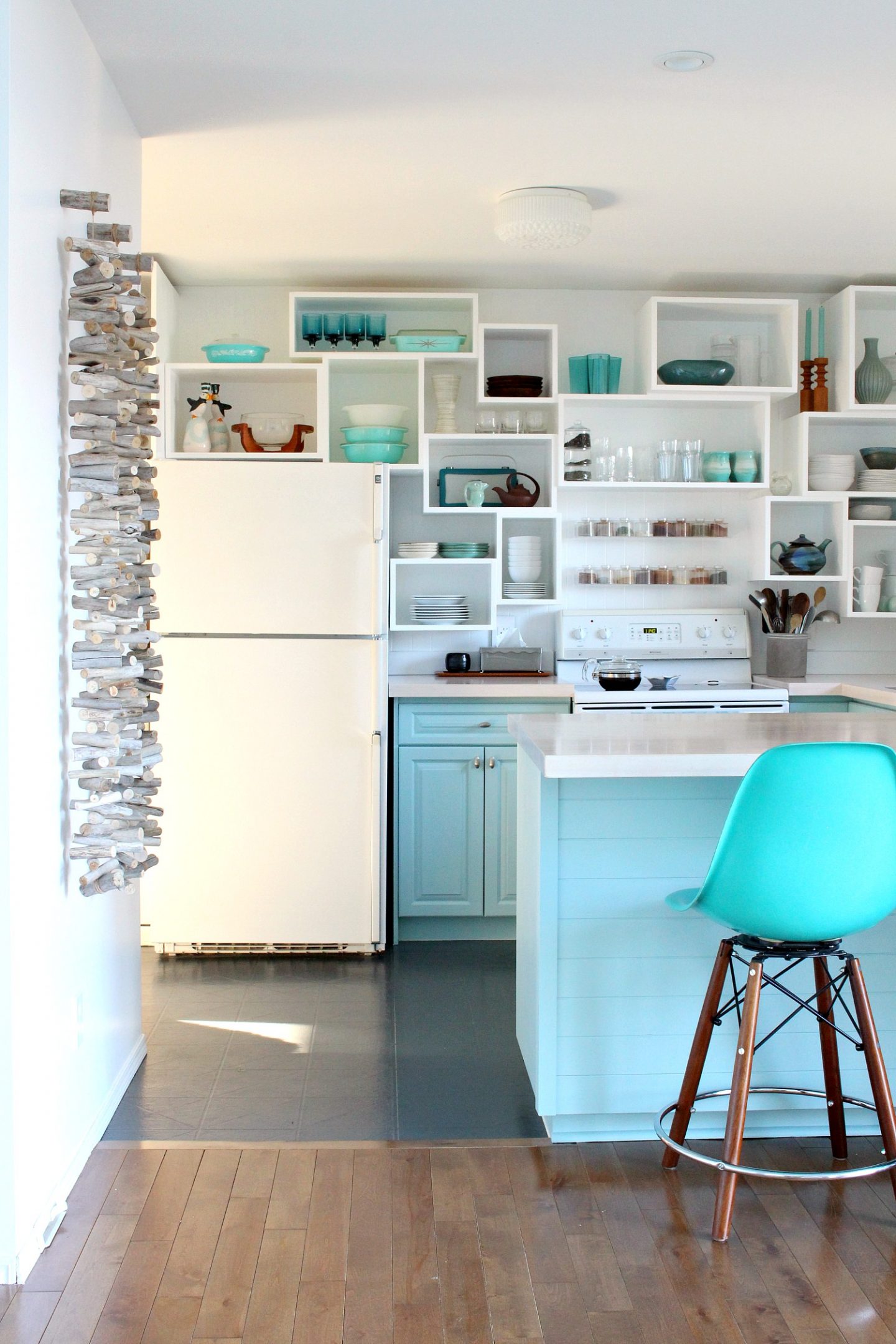
Surprise – here’s a look at the new Sherwin Williams Watery cabinet color in the kitchen!! I re-painted the kitchen cabinets (again), after stripping them down to bare wood. I’ll share my tips on how to strip cabinets soon, but I knew you’d want to see the fab new color (and find out why I repainted them) first.
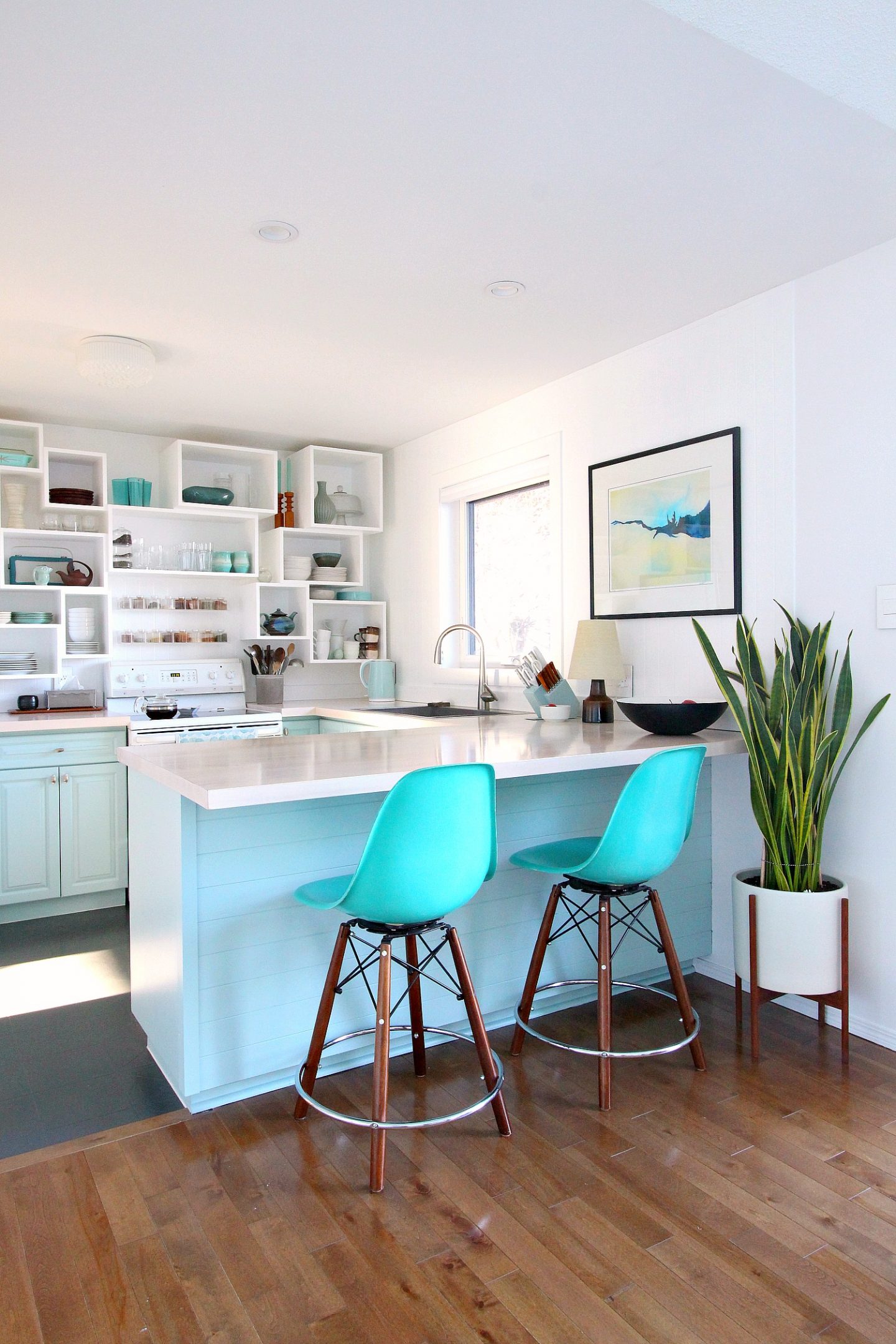
I chose Sherwin Williams Watery. I loved the soft blue/green/grey paint color we chose for my Mom’s dining room makeover. But the paint chip for that exact color (Sherwin Williams Open Air) looked way too blue in my house. It’s so, so important to not only see a paint chip, or sample pot, in the room it will be used – but also the same plane. Open Air looks SO different on a ceiling compared to a vertical surface. I ended up looking through my deck again and shortlisted two colors that were similar to Open Air but softer and less blue in my space: Copen Blue and Watery. Copen Blue was a bit duller and more green, while Watery was more of a soft aqua (and very close to my accent wall colors in the bedroom, office, and main bath). In the end, I chose the cheerier color of the two – even though I had originally envisioned something a bit more muted. The more muted Copen Blue looked beautiful on sunny days but on dreary days it seemed too sad, while Sherwin Williams Watery always looked cheery, no matter the lighting conditions – even at night.
I’ll share more photos of my “new” beachy kitchen at the end, but first I wanted to share a look back at the different DIY kitchen projects – and paint colors – I’ve done over the years, and talk about why I decided to ditch the inky teal I chose only a year ago.
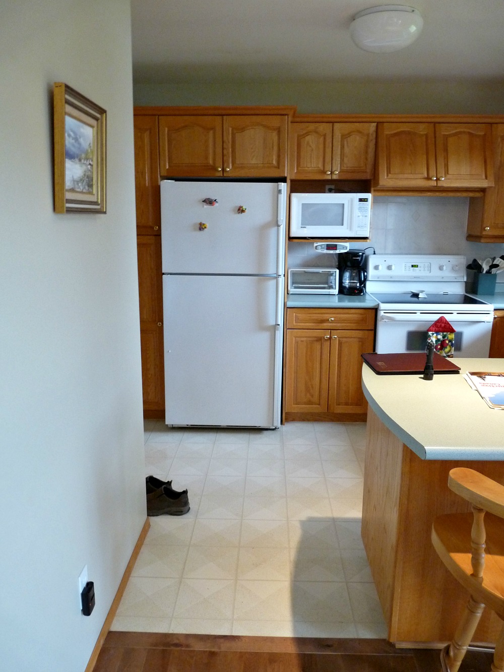
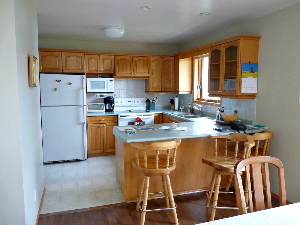
THE BEFORE
This was the before, when we bought the lakehouse seven years ago (don’t be fooled – half those upper cabinets were fake or utterly useless!):
VERSION 1 (Click here to see more):
This was my first version, with turquoise cabinets perfectly matched to my Butterprint Pyrex, simple white open shelving and ALL TURQUOISE kitchen ware – right down to the kitchen utensils, haha. This version was SO MUCH FUN. Hubby was Team Wood with our last kitchen, which I had really wanted to paint with black lowers and white uppers – way before it was trendy, btw, because it would have looked great with the black and white tile floor. So when we bought this house and Hubby said, “I hate the wood, paint it,” I was ALL IN. It was supposed to be temporary, so I figured I might as well go super bold. It ended up a little bolder than I anticipated, but I was also shopping with my future dream kitchen in mind: for example, the matching turquoise stools were bought with the intention of some day (soon) getting paired with brand new walnut cabinetry. But this fun makeover got a LOT of attention – so much attention that I was chosen to be featured in this bestselling book by a pair of famous bloggers, but then given the boot, lol, because the kitchen got “overexposed” with online features (and it caught the eye of Better Homes & Gardens back then too). I was actually super disappointed, but excited to see so many people were into my weird little kitchen makeover.
I should say that this DIY cabinet paint job was awesome – the finish was like a factory finish (see my steps here) and there was absolutely no reason to paint them again. Except…. this was supposed to be a temporary kitchen makeover. Five years, tops. But, instead, we bought a sailboat. And a sports car. Then a new roof snowballed into a total house exterior renovation. Unexpected home repairs popped up. So the kitchen renovation kept getting pushed to the back burner.

P.S. in this version I also painted the vinyl floors!
VERSION 2 (Click here to see more):
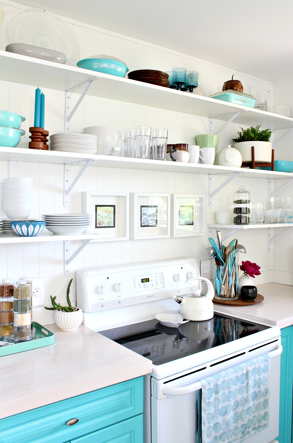
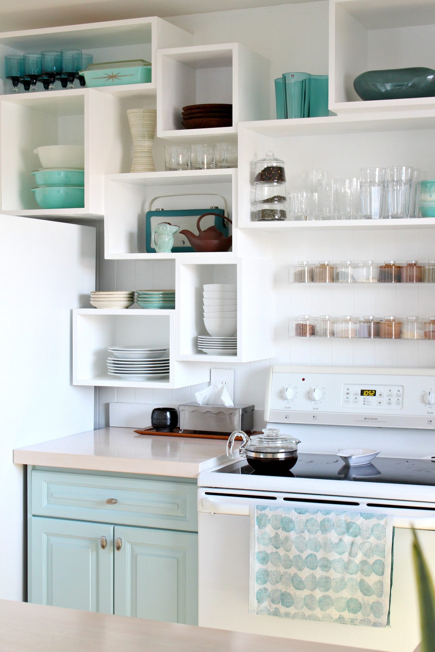
After some time, I rearranged the open shelving and loosened up my color palette a little to refresh on a dime. I had started collected more and more things thrifting – pottery, teak pieces, etc. – and also sold some of my best Pyrex finds in my Etsy shop to help fund the new roof. I did keep my every day Pyrex and also a few thrifted faves that now fetch a pretty penny. But relaxing the shelves and using more eclectic pieces was fun because I could now display sentimental glasses from my Grandmother and pottery mugs from Hubby’s sweet aunt. The all aqua and white palette had been super limiting, so this era was a lot of fun. And yes, I use what’s on those shelves! Some of it is for occasional use, like vases, but serving ware, glasses, plates, mugs, casseroles – all of that is used. Here are my honest thoughts on open shelving – something I always thought would just be dusty and useless…

VERSION 3 (Click here to see more):
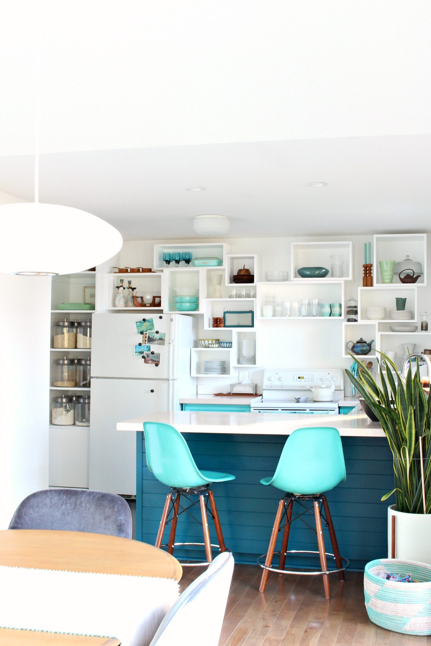
With a real kitchen renovation nowhere in sight, I pulled a tiny bit of budget away from other projects and added some panelling to the backs of the cabinetry, just to add a little interest. And I also started toying with a new cabinet color! Here’s a secret: I was torn between an inky teal and a paler than pale grey/blue/aqua so I polled the audience and the votes were initially divided too – but then ultimately really in favor of the inky teal. So I decided to go for it, because I thought it would be fun for you to see the popular color! Why not, right? It’s only paint – and although this is my home, I also want to create content that’s fun for YOU! And here’s another secret: there were two dark teals. At first I went with a lighter, dark teal because my Mom thought my real choice would be too dark, but within a few days I re-painted with the inky teal I had originally wanted!


Version 4 (Click here to see more):
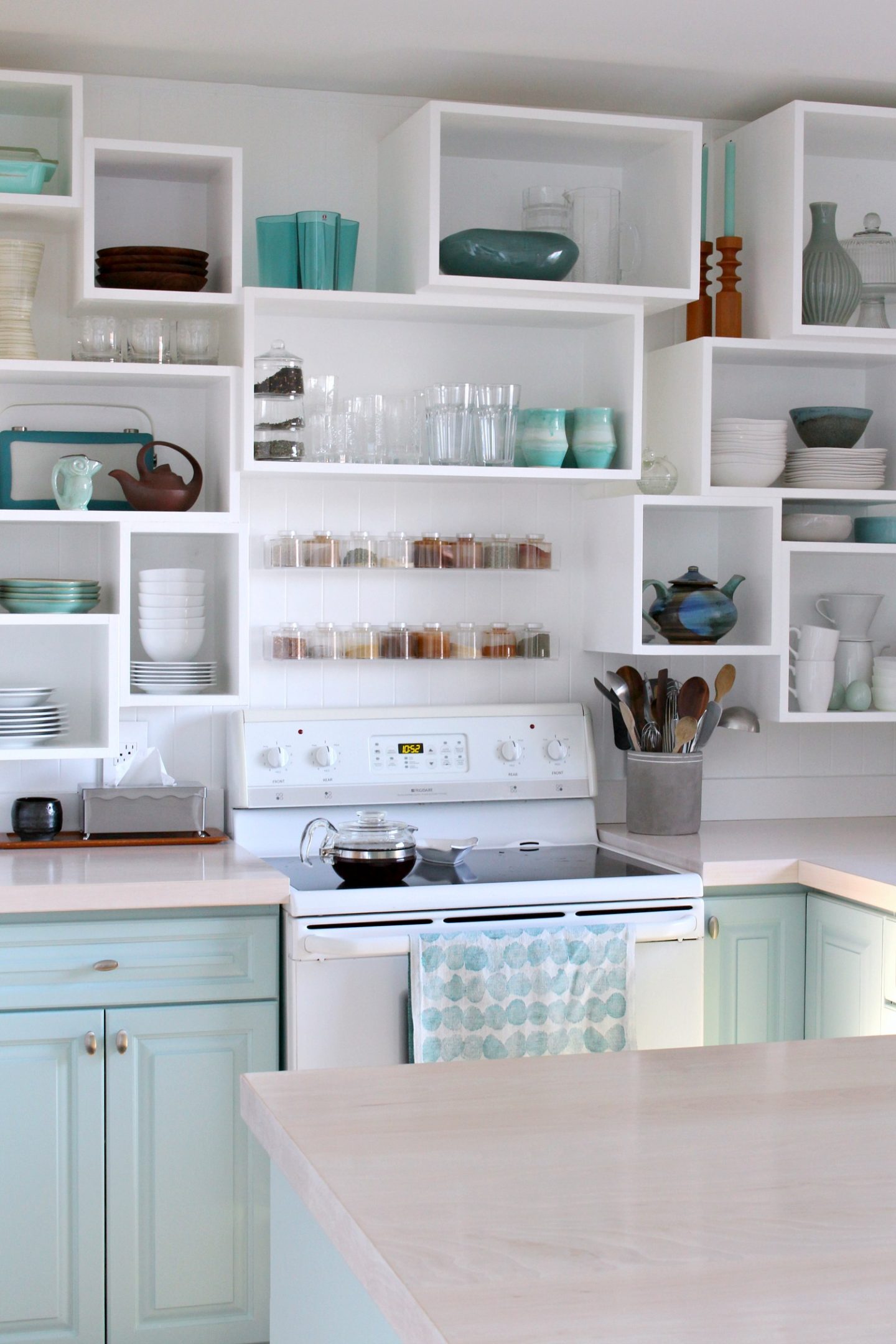
Version 4 was the introduction of CUBBIES! One day I just had this idea pop into my head and I HAD to see it happen. The open shelving had been a quick and cheap solution, but I wanted something a little more intentional and artful if this DIY kitchen was going to last a few more years. Because of stud placement, the open shelves had been asymmetrical which drove me bonkers so I leaned into that asymmetry with these cubbies. These DIY wall cubbies are still my fave and have made waiting for that someday reno a lot easier because the look is really fun and bold – like an art installation. Plus these cubbies, and the inky teal cabinet color that followed, landed me in TWO print publications in 2020 (Better Homes & Gardens and also Good Housekeeping).

VERSION 5 (click here to see more):
In Version 5, I finally committed to repainting all of the cabinets deep inky teal – thanks in part to the feature in Better Homes & Gardens. The editor loved the two tone but also pushed me to paint the rest of the cabinetry teal, something I had been meaning to do anyway! The two-tone was a result of laziness, lol. The teal in this version is NOT the same color as when I painted only the back half – this was a darker color, Ocean Abyss by Behr. I chose a semi-gloss finish and between the gloss and the deep teal paired with the crisp white walls and cubbies, the overall vibe had a cool mid-century meets nautical vibe. Plus the inky color really pulled the deeper colors out of my kitchen stuff – while making the lighter aqua items really pop. And I love how the turquoise stools popped too. They had gotten lost against the turquoise cabinetry.

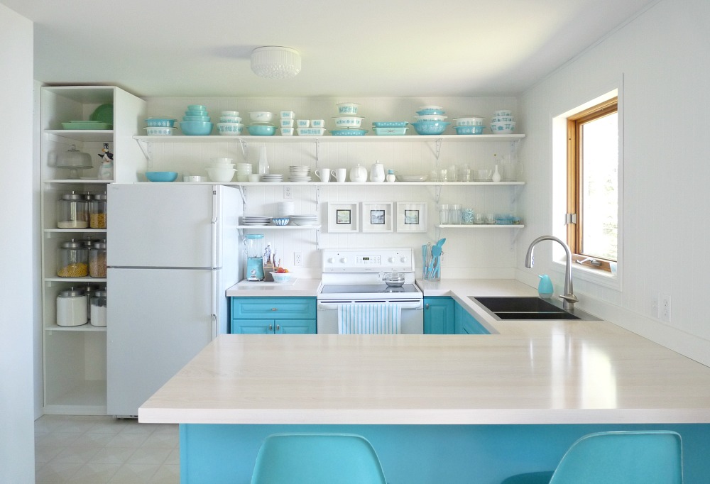
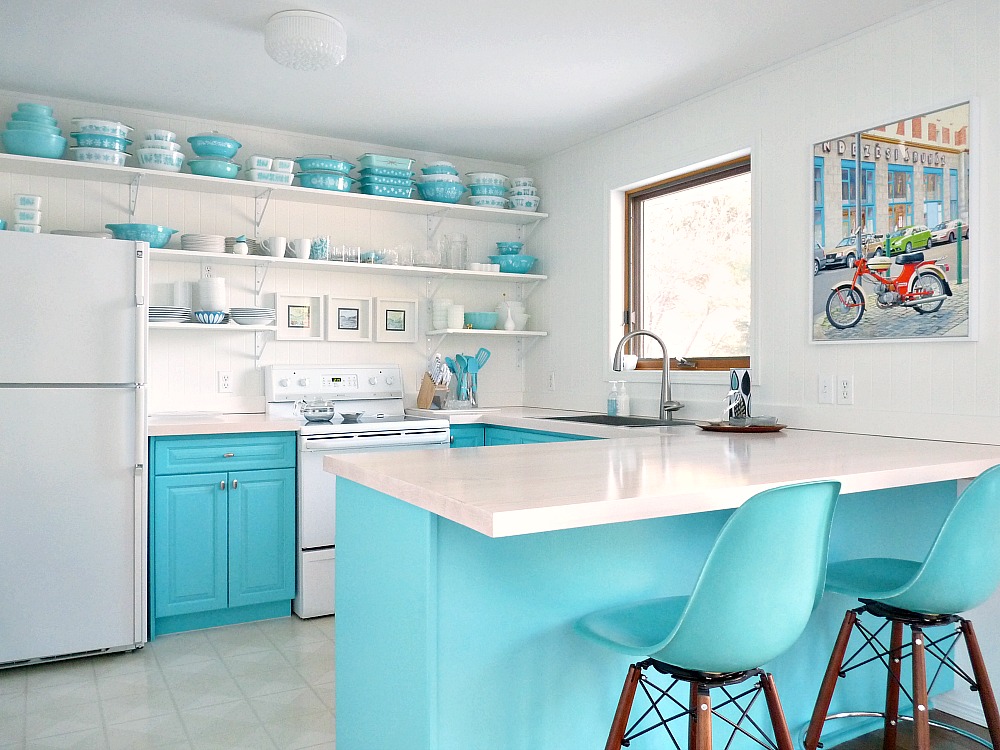
VERSION 6
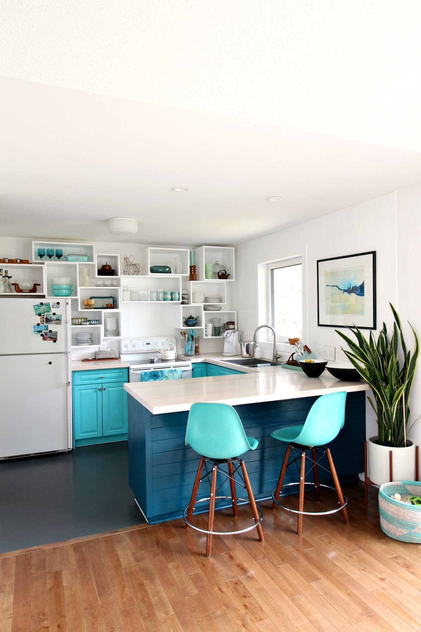
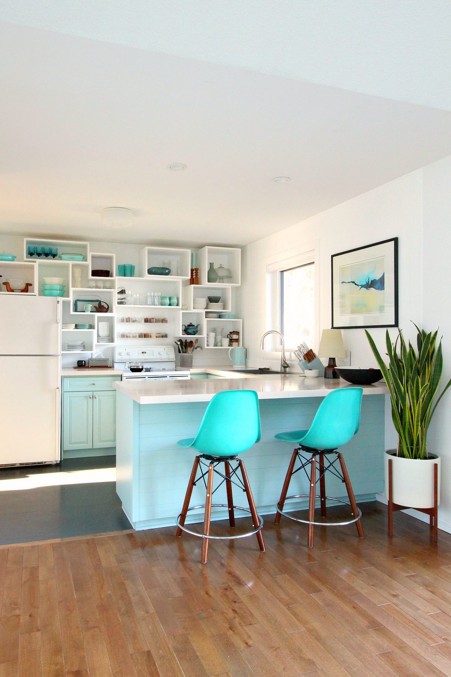
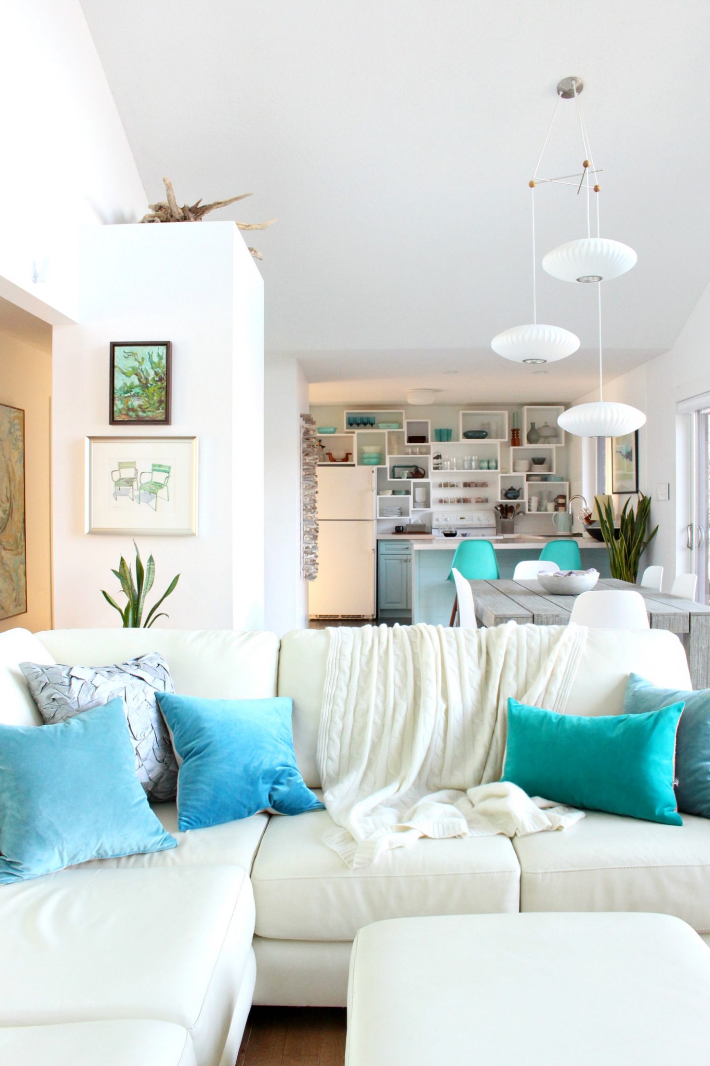
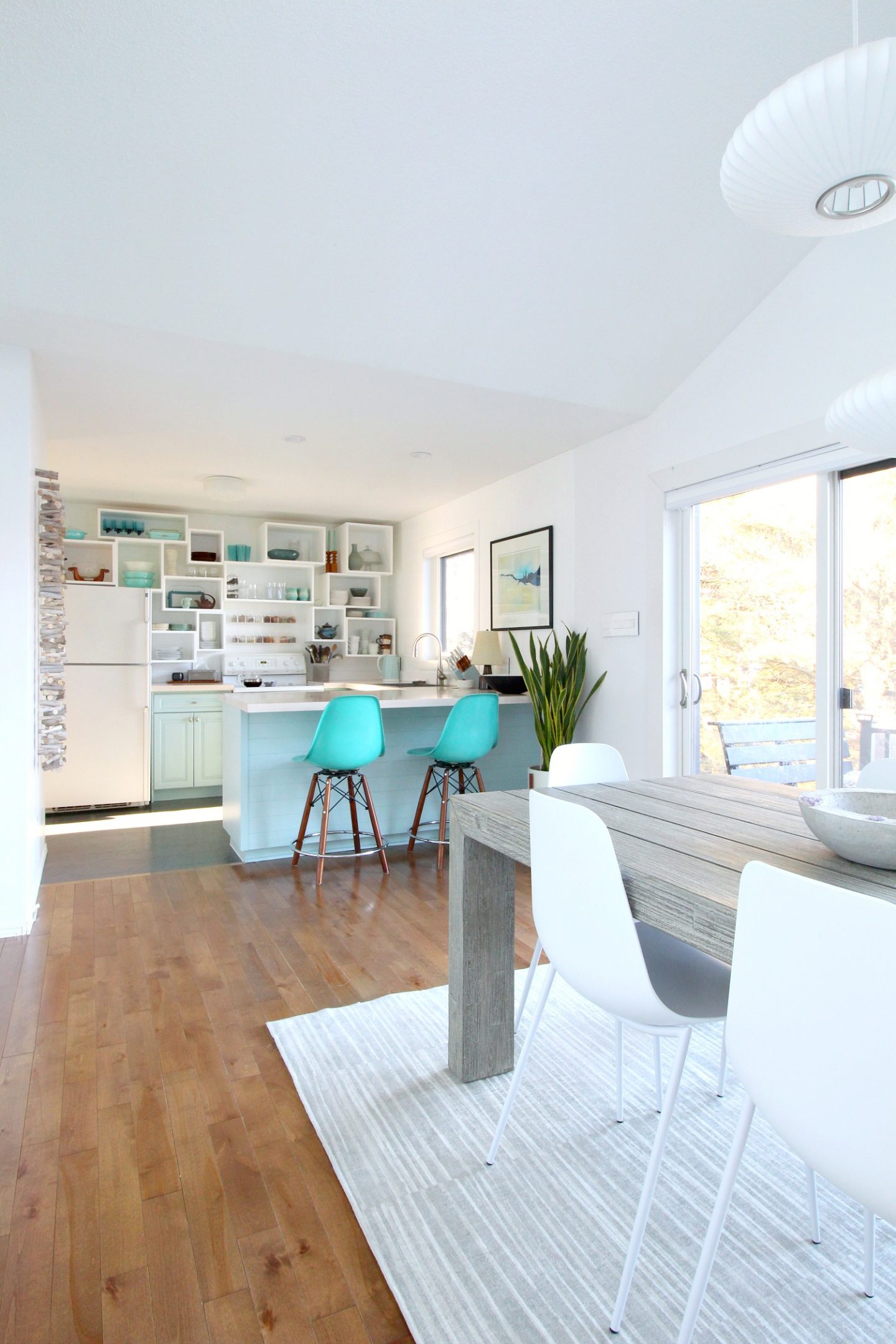
Version 6 is lighter and brighter! Amazing what just a new coat of paint can do, isn’t it? This current look, with the pale grey/green/blue cabinet color, the bold turquoise stools, the artfully mixed vintage kitchen ware (which we use!) displayed in my one-of-a-kind cubbies is my FAVORITE look of all. Although I have loved every version at the time, I love the fresh, airy openness of this color. The kitchen feels 10x bigger in real life and the MOOD is different in here: lighter and happier. Plus it suits the more coastal vibe of the new dining room furniture.

Why Did I Want to Repaint?
I loved the deep teal color. A dark, inky color like this does make a space seem smaller and darker, but used on the lower cabinets only, the kitchen still felt open enough. I loved the color but, unfortunately, the Behr paint did not hold up. Maybe it was the primer, maybe it was the layers of primer and paint already on there – but I also noticed the untinted Behr paint I used for the walls and cubbies wasn’t the same quality I was used to. I have a theory that maybe it froze on its way here, because it kind of seemed like paint that went bad. A little uncooperative and goopy. So I decided to strip it all off the cabinets, right down to the wood, and start fresh. Stripping the cabinets was super satisfying (here’s a little sneak peek – 250,000 people found it soothing too).
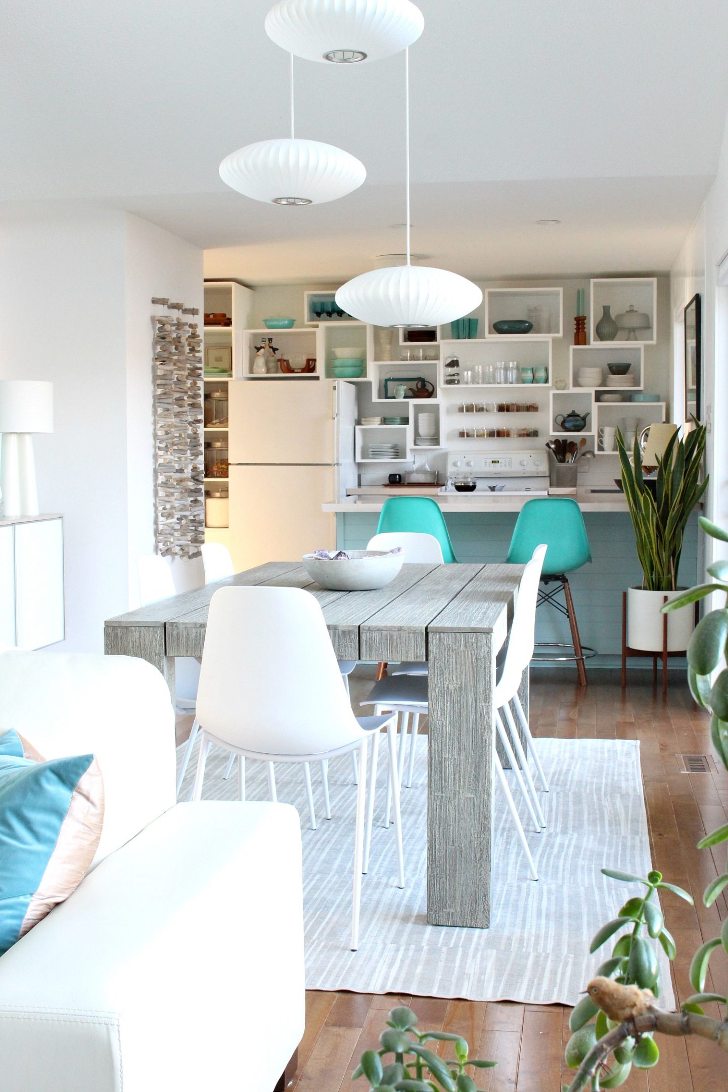
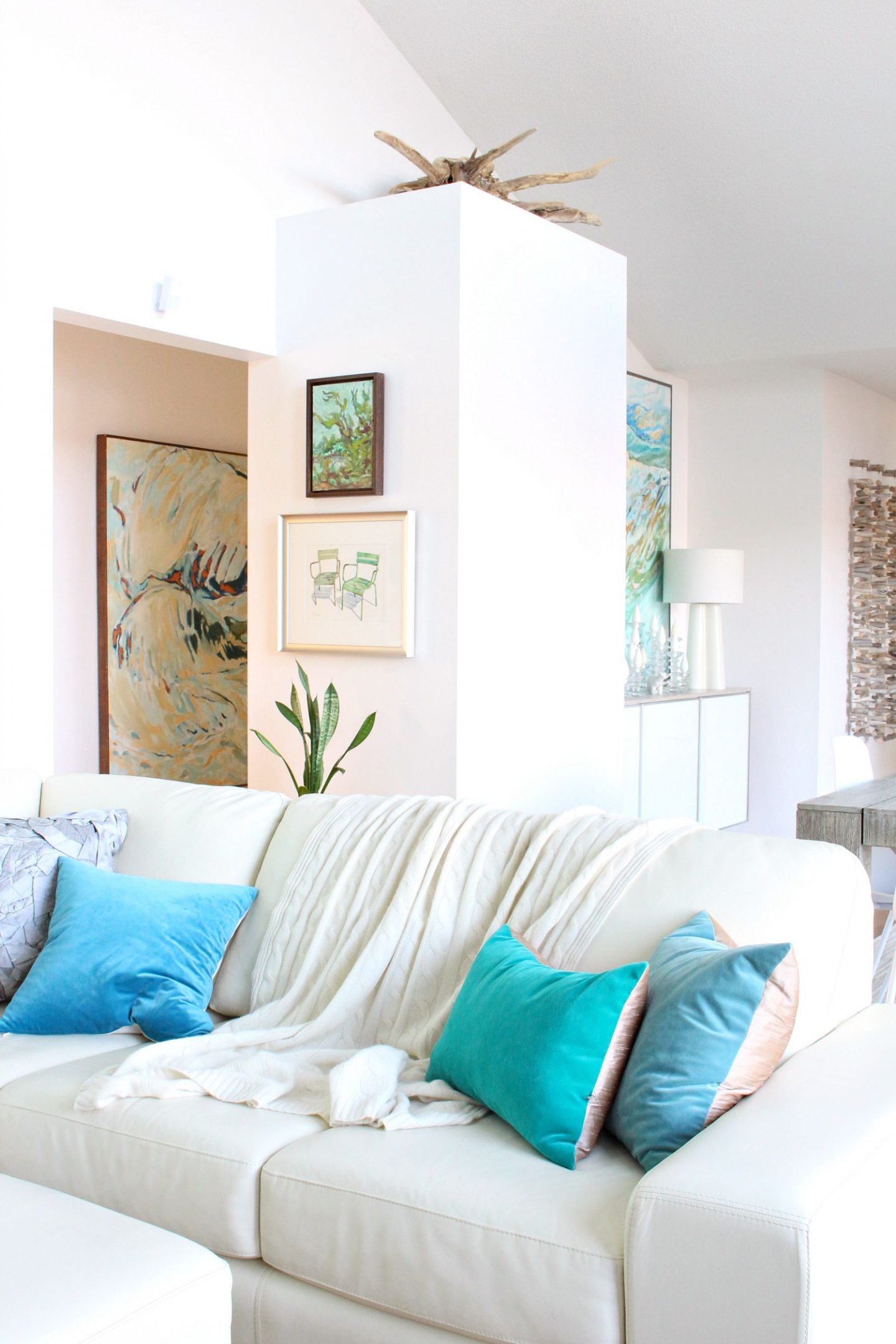
You might not see it in cropped interior photos, but I have a LOT going on in my open concept space: a lot of art, a lot of color. The deep teal pulled that color from the art, but also competed a bit for attention. I love how this color is softer and really lets the artwork take center stage. When you step back and take in the whole space, it really works!
Why a DIY Kitchen Can Be More Fun Than New:
I do still pine for the day when we’ve saved up enough again to renovate the kitchen for real. The dishwasher is an old one I scooped from a friend when he renovated, the oven temperate doesn’t correlate to what’s displayed so I’ve become a good guesser, and our fridge makes weird noises. I’d love to widen the U-shape, get a floor that isn’t painted vinyl (for real), and maybe get cabinets with doors again – maybe, lol, I have gotten used to the openness of my DIY cubbies.
But changing things up over the years has helped me fall in love with this DIY kitchen again and again. Each version lets me flex my creativity and try new things, and there’s something wonderful about that – something a shiny new kitchen can’t do! Plus I never worry about wrecking things in here. I re-pot plants on the counter, use it for art projects, make soap and candles in here, and make a mess canning. I truly USE this space because it’s not precious or expensive – and it can all be repainted if needed. It’s freeing and liberating! So while I can’t wait to renovate, there’s also something awesome about a budget-friendly DIY kitchen. So if that’s the stage you’re in, celebrate it! Do weird stuff, get messy, experiment with your style, and enjoy it.

Love the new colour – it really softens up the entire space. Great job!
Author
Thank you so much! I love the softness too 🙂
I totally get why you chose this beautiful color. The lighter and brighter version will make it feel spring-like sooner, and as if summer lasts longer. I’m all for that!
Author
Thank you! Summer is my favorite season so I am thrilled to make it feel more summery and beachy in here all year round. A little oasis from the snow, haha.
I loved the last color but I am IN LOVE with the new color! You have such a vision!!
Author
Thank you so much! I have had so much fun choosing cabinet colors!
love it.
Author
Thank you so much!!
Looks really good, I like the lighter colour, the previous inky blue was not enough contrast with the floor. I still like #2 and 3 better because of the straight open shelving, the cubbies visually drive me nuts because they don’t line up (yes I have issues, haha). And I loved all the pyrex. I also LOVE that driftwood wall hanging, looking forward to the tutorial, its going on my “to do” list this winter, if its not too difficult.
Author
Thanks Cathie! But did you notice the plain open shelving wasn’t centered on the stove? That’s what drove ME nuts, lol, but because of the stud/bracket placement they ended up that way. So we just have different issues, haha. I figured if they can’t be perfectly symmetrical, total asymmetry is more my jam. Relaxes my brain this way 🙂
Looks great! I’m a huge teal fan so like all the iterations. Still on team inky teal as my favorite but I also like the softer teal currently. TEAL YEAH!
Author
Thank you 🙂 I haven’t strayed very far from my love of all things aqua/turquoise/teal haha!